
Scoreboard
The scoreboard shows each player’s identity and match state (name, deck, life, wins). Configure it in the Scoreboard section of the overlay panel.
Layout mode
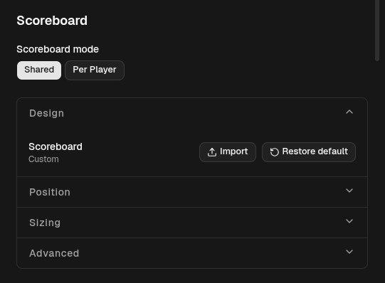
Section titled “Layout mode”At the top, Scoreboard mode is a two-button switch:
- Shared — one graphic shows both players. This is the default; the bundled scoreboard is a single bar across the top.
- Per Player — the left and right players get separate graphics you position independently. Choosing this splits the settings below into Left Player and Right Player.
Sections
Section titled “Sections”The rest of the scoreboard settings are grouped into collapsible sections:
- Design — the scoreboard graphic. Import loads your own SVG file; Restore default returns to the built-in one. The status line reads Default, Custom, or No scoreboard. To build your own graphic, see Custom Scoreboard SVG.
- Position — Anchor and Offset (px). See Anchors & Offsets.
- Sizing — Scale (%), where
100is the graphic’s native size. - Advanced — the field mappings (below).
Field mappings
Section titled “Field mappings”Field mappings connect elements in the scoreboard graphic to live player data, so a life total or name updates on screen automatically. Each row has:
- an SVG element id — the id of the element in the graphic to fill,
- a field — which value to show (see below),
- a side (Shared mode only) — Left or Right player.
Use Add to create a row, the trash icon to remove one, and Reset default mappings to return to the built-in set. If there are no mappings, the graphic’s text stays exactly as drawn.
Player fields
Section titled “Player fields”| Field | Shows | Set in |
|---|---|---|
| Name | Player name | Players section |
| Deck Name | Deck / archetype | Players section |
| Standing | Free text, e.g. 3-1 |
Players section |
| Pronouns | Free text, e.g. she/her |
Players section |
| Life | Current life total | Match controls, live |
| Wins | Games won this match | Match controls, live |
Name, deck, standing, and pronouns are identity fields you set once in the Players section. Life and wins change during the match.
Config reference (JSON)
"scoreboard": { "mode": "shared", "shared": { "svg": "@bundled-default", "anchor": "top-center", "scale": 100, "offset": { "x": 0, "y": 24 }, "fieldMappings": [ { "id": "left.life", "field": "life", "side": "left" } ] }}mode—sharedorper-player.shareduses thesharedconfig; otherwiseleftandrightare configured separately.svg—@bundled-defaultfor the built-in graphic,nullfor none, or a full SVG string for a custom one.fieldMappings—{ id, field, side }, wherefieldis one ofname,deckName,standing,pronouns,life,wins.